Objective
To create a Bright and Informative Packaging Design for Gallivant Ice Cream. Map Hoarding and Product info. Standee for Stall.
My Role
Ideation. Design. Production Management*
The idea was to make an outstanding packaging design according to the U.S. market,
I found it a little tough at first because I was unaware of the other competitors.
But, after my in-depth research into other brands and target markets, eventually, it became simple.
I wanted to fulfil every requirement of design, as it is ice cream I wanted to add enjoyably,
bright and cheerful colours, Indian feeling as the main recipe is Indian and last informative that how
Gallivant brings you traditional flavours from all over the world.
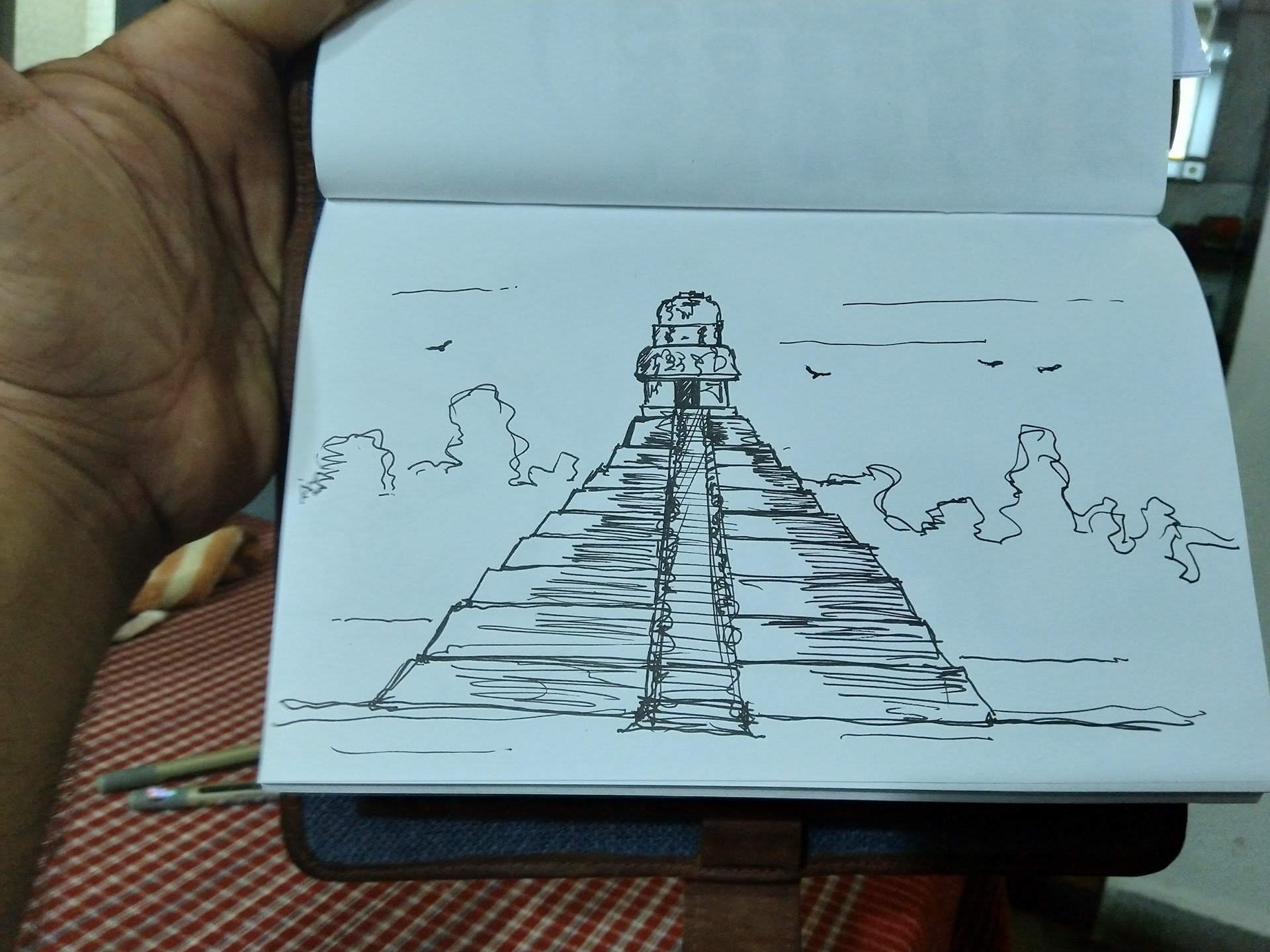
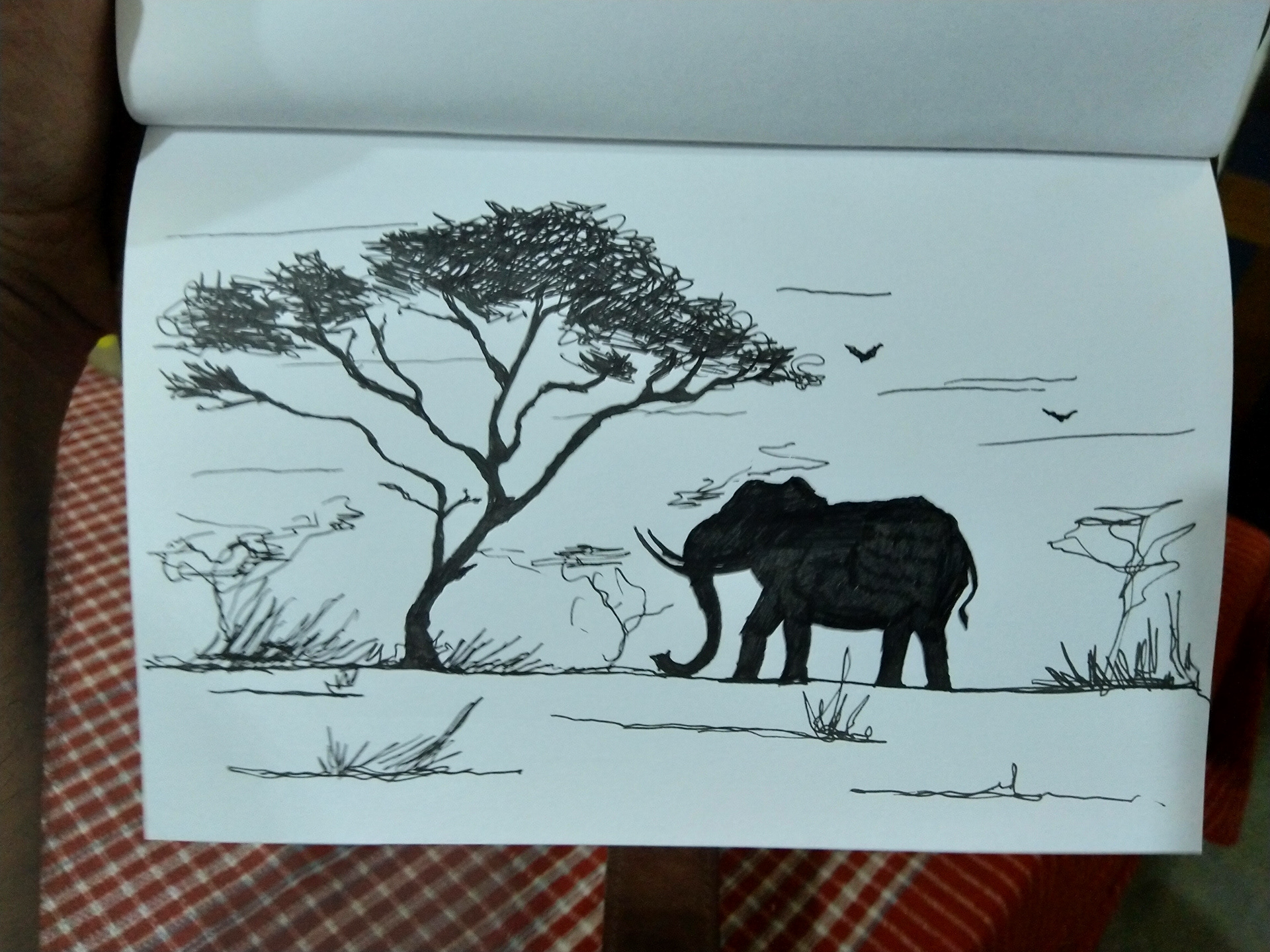
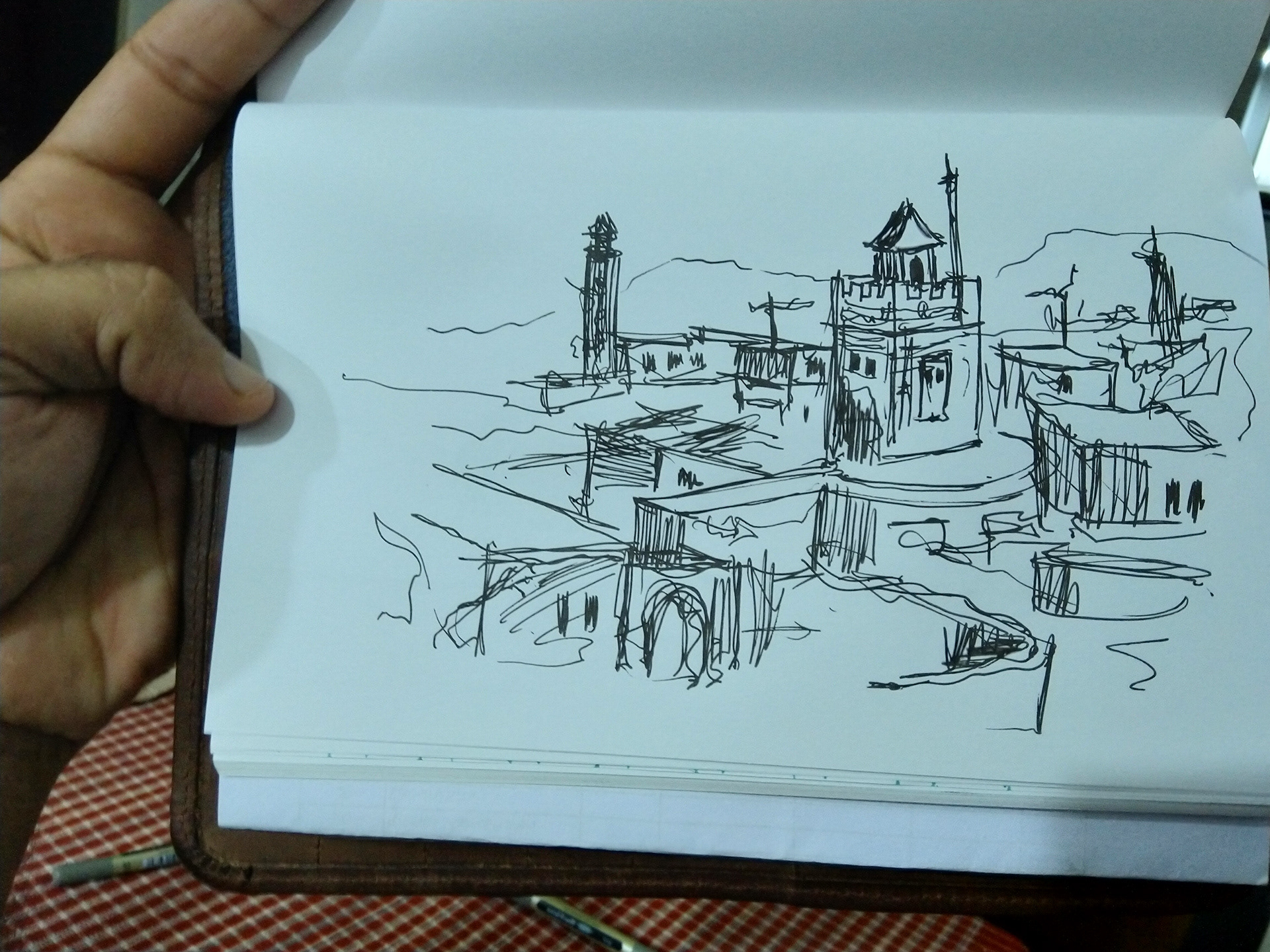
I wanted the design to be Raw, but I also wanted to be a clean one, so I added a hand-sketched drawing of the famous heritage or place for every country and its ingredient. Ticket button for every flavour name that mentions the country name on the back of it. To make it informative and interesting, I added a picture of the ingredient and a fun fact about it including thoughts about why they made that specific Flavour. Not to make the product look flat I used a Gradient colour background to give the label dimension.
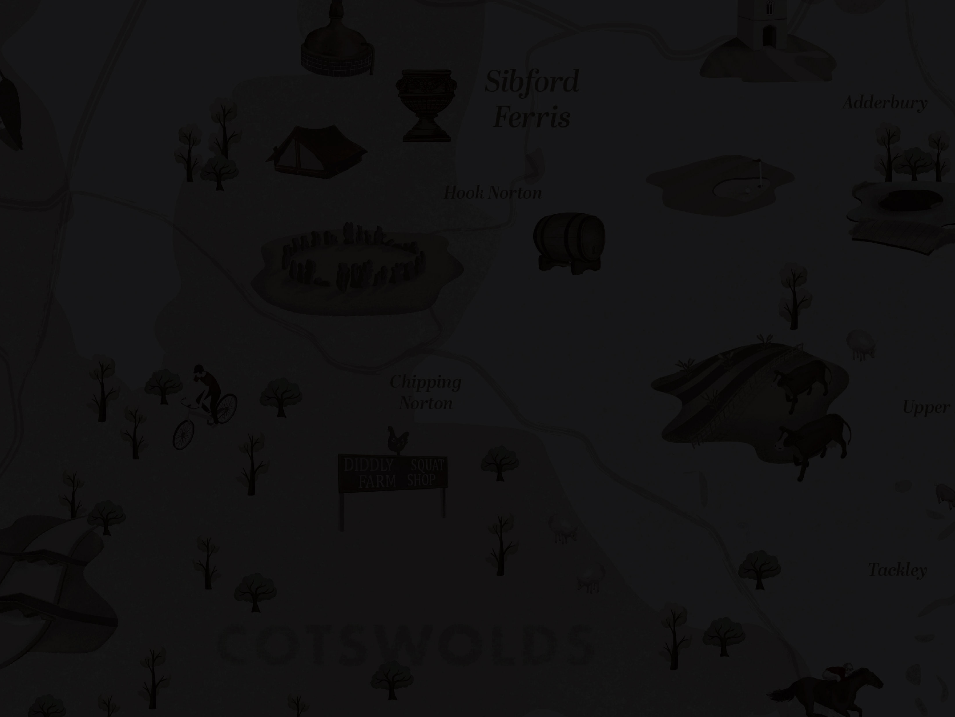
Map Design for Flavours journey
*The project is done while I was working at Roar Studios.
